A/B Testing: Begin with a Problem and Hypothesis
When I talk to people new to the world of A/B testing, I all too often hear something like:
“I saw this example of a site that changed the color of their ‘Buy’ button and got a YY% increase, but when I implemented the same it converted worse than my original!”
The problem with this “dive right in” approach of testing minor design changes without a clearly defined problem is that if the new version doesn’t increase conversions you’ve learned practically nothing, and if it does work, you aren’t really sure why.
Problem & Hypothesis
A better approach is to take one step back and instead do the following two things before diving into test variations for e-commerce conversion rate optimization:
- Determine the problem you are going to solve, such as a high bounce rate on your landing page or a high abandonment rate at step 2 during your checkout process. This gives you a clear idea of the problem your new designs should solve, as well as the criteria for success – did the bounce rate lower on your landing page?
- Articulate a hypothesis as to why you believe the problem occurs, such as “our customers leave because they don’t immediately understand the product’s features” or “our customers don’t trust the claims on our marketing site”.
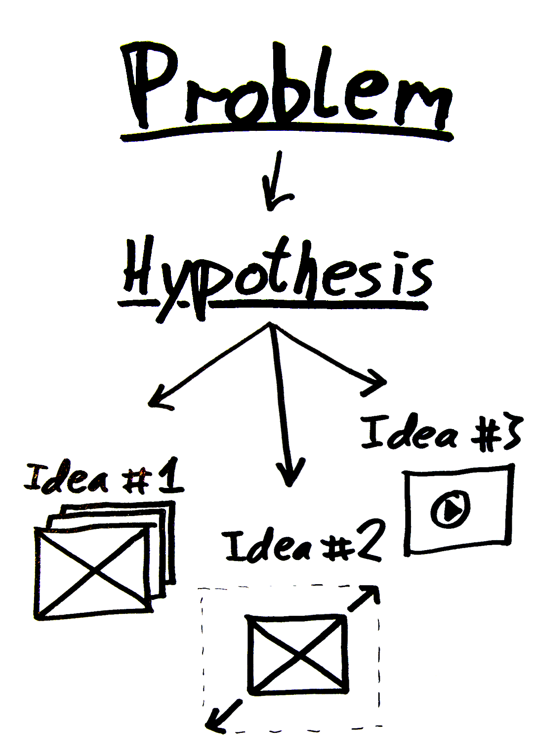
Start with a problem, then a hypothesis, and finally concrete test ideas.
Once you’ve 1) determined the problem and 2) articulated a hypothesis, you’re ready to brainstorm on actual split-test variations. With a clearly defined hypothesis you can easily come up with truly different variations, instead of testing yet another trivial tweak of the same old idea “change button color from green to red”.
Say your hypothesis is “our customers don’t trust the claims on our marketing site”. Then you might try out various solutions such as: placing a customer quote right below the headline, adding a video “proving” your claims, extending your return policy with 2 weeks, etc.
These are all substantial changes that are likely to make a real impact on the performance of the page. The result might be positive or negative, but in either case, you tested something substantial and came a step closer to learning something meaningful about your audience, instead of “they like ‘red’ buttons better than ‘green’ buttons”.
User experience research, delivered twice a month
Join 25,000+ readers and get Baymard’s research articles by RSS feed or e-mail:
Topics include user experience, web design, and e-commerce
Articles are always delivered ad-free and in their full length
1-click unsubscribe at any time
Related articles:
- Jon Powell’s blog post on MarketingExperiments where he goes through seven steps for proper test planning (including problem and hypothesis)
- The Conversion Rate Optimization Industry in 2015
More E-Commerce Research
Free Research Content:
- Popular Articles · a listing of our most popular research-based articles on e-commerce UX
- UX Benchmark · benchmark with case studies of 123 major e-commerce sites ranked by e-commerce UX performance
- Page Designs · navigate 9,200+ manually annotated full-page screenshots categorized by page type
Products & Services:
- Baymard Premium · full access to all 620 research-based design guidelines, UX case studies, page designs, and review tool ($720-$3,000 / year, based on plan)
- UX Audit · get an in-depth analysis of your site’s UX, conducted by a Baymard researcher ($1,900-$9,700 based on scope)
Comments
Premium Research
Get full access to Baymard’s 78,000+ hours of research and empower your UX team and decisions.
Audit Service
Get Baymard to audit your site’s UX performance, compare it to competitors, and identify 40 areas of improvements.


DennisFebruary 21, 2011
Super. Excellent. Its super important to have this defined before starting to play with button colors and different headlines.
Problems can be in area’s like:
- Trust
- Ease of use
- Stock
- Pricing
Then try testing with idea that solve that problem!
Christian, Baymard InstituteFebruary 22, 2011
Thanks.
All great suggestion for factors that can be problematic.
Chase from ReSciFebruary 23, 2017
Christian,
Great post! A/B testing the REAL issues or actions you want, instead of every little thing will go really far. People don’t view it scientifically and just hear it works.