Improve Validation Errors with Adaptive Messages
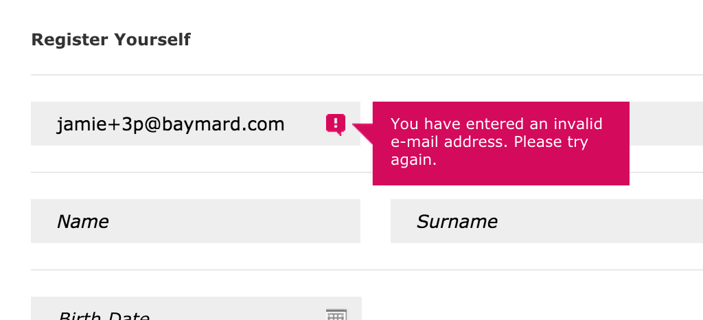
This is pretty much as bad as it gets. The user is just told their input is invalid with no hints as to why that is or how they can fix it.
Form validation errors are inevitable. Yes, they can (and should) be minimized, but validation errors won’t ever be eliminated – they are a natural part of complex forms and user’s data input. The key question then is how to make it easy for the user to recover from form errors.
In this article we’ll go over findings from our usability studies on how the wording of validation error messages largely determines the user’s error recovery experience, and how “Adaptive Error Messages” have shown to significantly reduce the user’s error recovery time.
Common fields that we frequently observe to cause cause validation issues during testing include: phone number (formatting), state text field (‘TX’ vs. ‘Texas’), dates (month names or digits), monetary amounts (decimal separator, thousand separators, currency, etc) credit card number (are spaces allowed?), and address (street number in address line 1 or 2?).
Generic Error Messages
When benchmarking the checkout process of 100 major e-commerce sites, we found that most form validation error messages are woefully generic. This is problematic because it doesn’t do much in way of helping the user understand what the error is and how to fix it. Generic error messages tend to run the spectrum from unhelpful to completely useless. For instance, during benchmarking we saw the ‘Phone’ field yield error messages such as:
- “Invalid”
- “Not a valid US phone number”
- “Not a valid 10-digit US phone number (must not include spaces or special characters)”
The first error message is obviously the worst as it offers zero help as to why the input isn’t accepted – it just states that the site doesn’t consider it “valid”. The second error message is still pretty bad, in that it just says the input isn’t a “valid US phone number” but it doesn’t hint at why that might be. The third error message is better than the others because it not only states that it must be a US phone number but also indicates that a country code, spaces, or other formatting, will cause the validation to fail even if it actually is a legit US phone number.
However, even though the third error message is the best of the generic error messages, our usability tests showed that it is still far from ideal because it doesn’t show the user what the actual problem is. Without any indication of what the actual error is, the user will basically have to do all the work figuring this out themselves.

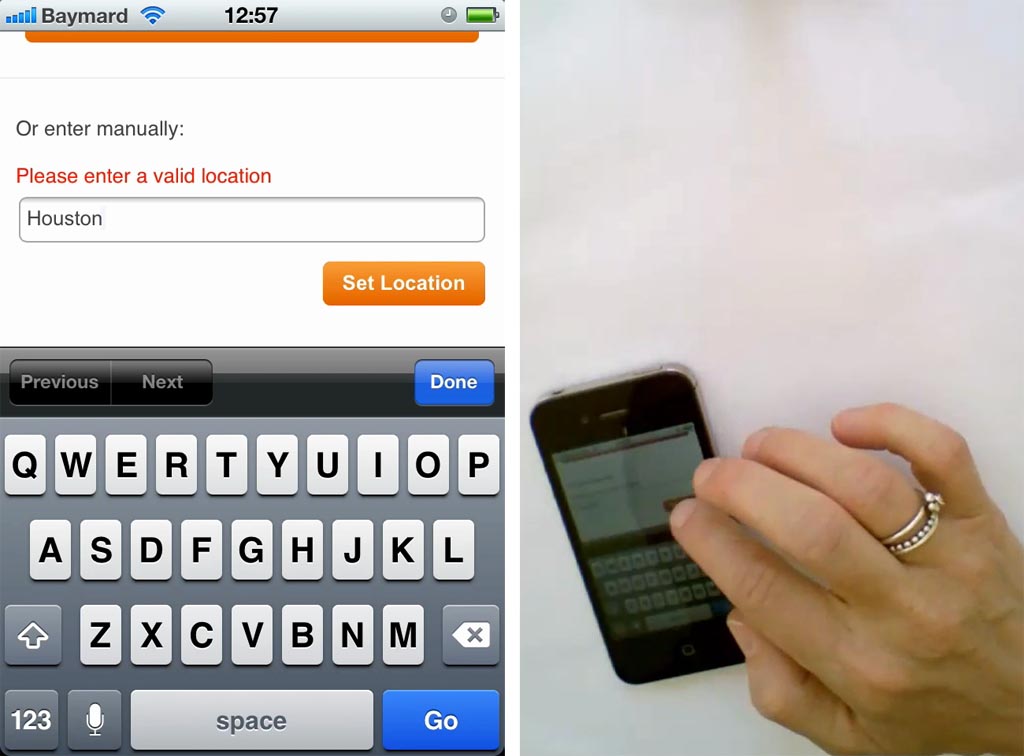
During our mobile commerce study this subject first entered her phone number but included spaces which provoked a validation error. While this should not cause a validation error at all, the error message itself should at the very least tell the user what the problem is. In this case, the subject thought she might need to add a country code, but that also did not work (middle image). She then removed the country code but during editing, accidentally removed another digit too. So while the phone number was now formatted correctly, it only had nine digits. Alas, at this point the test subject no longer trusted the error message as she it had told her the exact same thing for all three input variations, and instead concluded the site was “broken” and abandoned the purchase.
Most of the time having to figure out what caused an error is just tedious for the user. During our usability studies the test subjects were often observed spending an inordinate amount of time trying to fix errors with generic error messages – especially of the first two types, although plenty struggled with the third type as well, leading to repeat validation errors. Obviously this results in a poor user experience although the subjects were able to work it out most of the time.
However, where things get really thorny is when it isn’t immediately obvious to the user why their input is deemed invalid. This can be downright harmful because it effectively forces the user to guess how to fix the input through trial and error – or give up and abandon their purchase, a route we’ve seen many subjects begrudgingly trudge down.
Adaptive Error Messages
Luckily, testing also revealed a solution to this problem: adaptive error messages. These are error messages that adapt based on what invoked the validation error and use this to provide the user with helpful instructions on how they can correct their input.
In other words, adaptive error messages dynamically change to best match the user’s situation. For example, if a user tried to provide “john.newman@gmail” in an e-mail field, an adaptive validation error message would read “This email address is missing a top-level domain (such as ‘.com’).”
While the copywriting of this validation error message could be optimized, it is still light years ahead of a generic error message as it alerts the user to the specific problem identified in their input. This makes it instantly clear to the user what the issue is and how they can fix it.
This is vastly superior to generic error messages because it alerts the user to the actual validation failure and provides them with an easy way to fix it. If we go back to the earlier phone error example, an adaptive error message could tell a user who had submitted their phone number with a country code that: “It seems the provided phone number includes a country code (‘+1’) which isn’t accepted by the site – please provide a 10-digit US phone number without country code, spaces, or special characters.”
Letting the user know why the validation failed, it makes it much easier for them to fix it. During testing we observed it to drastically improve error recovery time, and perhaps even more critically helped reassure the user that their input in itself wasn’t wrong but that they had just provided it in a format the site was incapable of processing.
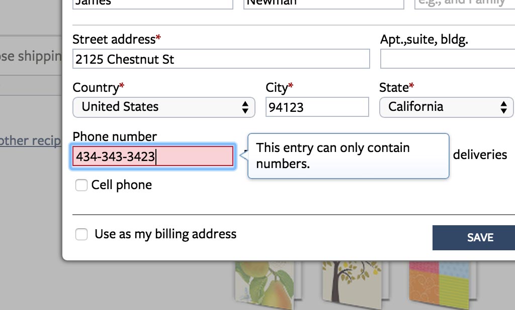
Instead of simply reading “Invalid password”, or “Password should contain 6 digits, ..” Symantec provides the user with an error message specific to the validation rule triggered. Here a user has entered their email as password and is told that this is not allowed – an error message that’s much clear and easy to recover from.
When a user leaves a required field blank but fills out all other entries in the form it is most likely because they are uneasy about providing that information. Here an adaptive error message “identifies” this user concern for privacy and returns an explanation as to why the phone number is required and and reassures the user of how and what it will be used for.
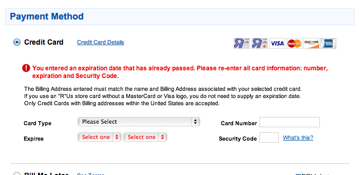
Instead of providing the user with a generic “credit card not accepted” message, Toys’R’Us returns the part of the payment error that was returned. For more on card decline errors, which are notoriously generic, see How to Recoup 30% of ‘Card Declined’ Abandonments.
Now, ostensibly the reason most sites don’t do this is because it is difficult. However, if our validation rules are smart enough to identify these types of errors, we should be able to inform the user about the exact problem identified rather than handing them a generic error message. It is precisely because validation errors can be caused by such a wide range of reasons (i.e. the input’s content, length, formatting, etc) that it is so important to let the user know exactly why their input failed because they’ll otherwise have to try and work it out themselves.
So there we have it. Adaptive validation errors – the smarter, situation-aware error message that let’s the user know exactly what the problem is and how to fix it. A much improved validation error experience that the user can easily recover from.
Of course avoiding validation errors in the first place is ideal. The perhaps easiest way to lower validation errors is by accepting all common inputs and formats (and then perform any necessary data and formatting harmonization in the back-end). Other useful strategies include providing proper inline help and formatting examples, indicating both required and optional fields, having helpful field descriptions, and auto-detecting content where possible. Also, consider whether a validation warning might be more meaningful than a validation error.
This article presents the research findings from just 1 of the 580+ UX guidelines in Baymard Premium – get full access to learn how to create a “State of the Art” cart and checkout user experience.
User experience research, delivered twice a month
Join 25,000+ readers and get Baymard’s research articles by RSS feed or e-mail:
Topics include user experience, web design, and e-commerce
Articles are always delivered ad-free and in their full length
1-click unsubscribe at any time
Related Articles
More E-Commerce Research
Free Research Content:
- Popular Articles · a listing of our most popular research-based articles on e-commerce UX
- UX Benchmark · benchmark with case studies of 123 major e-commerce sites ranked by e-commerce UX performance
- Page Designs · navigate 9,200+ manually annotated full-page screenshots categorized by page type
Products & Services:
- Baymard Premium · full access to all 620 research-based design guidelines, UX case studies, page designs, and review tool ($720-$3,000 / year, based on plan)
- UX Audit · get an in-depth analysis of your site’s UX, conducted by a Baymard researcher ($1,900-$9,700 based on scope)
Comments
Premium Research
Get full access to Baymard’s 78,000+ hours of research and empower your UX team and decisions.
Audit Service
Get Baymard to audit your site’s UX performance, compare it to competitors, and identify 40 areas of improvements.


Stomme poesFebruary 10, 2015
The worst part is when your email address is completely valid according to RFC 2822.
That is, =^.^=@kitty.cat ought to be accepted (even though, yeah, many mail servers are also stricter than the RFC…).
Over here, we’ve gone back to the “it needs at least a character, then an @, then something, then at least one 1 dot with something after it” and no further. In other words, the simplest possible validation, and then displaying the typed-in email prominently somewhere in hopes that the user will actually check it.
Another bugger is complaining when I don’t fill in the “State/Province” section— when I know my postal service does not use it, and makes my mailing address look really weird over here. If they do not use it, you do not need it. Use Null in your database of choice appropriately, instead of making it the user’s problem.
Jamie, Baymard InstitueFebruary 10, 2015
Yes exactly, making it even more important that the user is told why the site rejects it.
Chris PoteetFebruary 10, 2015
This is good advice. Two things:
1) I’d be interested in how you would rewrite the microcopy in your “better example” of the phone number error message.
2) This was out of the scope of the article, but I think a good follow up would be how to prevent these to begin with label masks and/or explanatory text next to inputs.
Jamie, Baymard InstitueFebruary 10, 2015
1) There’s several phone examples in the article:
The first example in the article could instead read:
“Special characters [character, here +] are not allowed” (ignoring for a moment that + should not invoke an error in the first place)
Toys’R’Us 1: “Spaces are not allowed. [generic followup]”
Toys’R’Us 2: “Country code are not allow” or “Special characters like [+] are not allowed.” followed by “Please enter a valid 10 digit US phone number without country code.”
Toys’R’Us 3: “The phone number provided only have 9 digits. Please provide a 10 digit US phone number, without spaces or dashes.”
2) See the list of related articles below the main article text. I’ve moved some of the articles mentioned inline to the ending section as well.
Suresh KandeebanFebruary 10, 2015
Nice article.
I agree with you that it will be of great help to the users however as you mentioned the real challenge is speculating every missout/error scenarios possible and writing context specific error messages.
What are your thoughts when there are multiple missouts in the field entry. Say for example, user misses both @ symbol and .com in the email address field.
Tim Leighton-BoyceFebruary 11, 2015
One recommendation: track the errors in Google Analytics, or your system of choice. Once you see the number of people affected it can help focus attention on the problem. And maybe you can even get the numbers to go down. Use virtual pageviews for this in GA and it will even calculate an ‘exit rate’ for you (but Events may be more appropriate).
Bonus tip: if you include the text of the message in the report it can remind people again and again just how awful the copy is.
Tomas KaplerFebruary 13, 2015
The best what can be done for many errors is to prevent them entirely – e.g. when requesting phone number without dashes, why not simply remove them? Or when some password is required, why not simply create it (and show/send) unless user wants his own? Or when typing in a city, why not show an ajax autosearch selection? …
And what i hates most, when after some small error the whole form is deleted, e.g. like in that Toy’s for you credit card validation error.
So almost all your examples are far from optimal, and adaptivity of the messages is just trying to solve a problem that would not have to be there if the developer would not be a jerk
Santiago ValdarramaFebruary 15, 2015
Nice article. Really enjoyed reading it. Although I agree 100% with everything, my advice would be to always try to avoid the error message in the first place. I posted all my thoughts on my blog: https://blog.svpino.com/2015/02/14/improving-validation-with-adaptive-messages
Kevin February 16, 2015
This article touched on a personal pet peeve of mine – the phone number field. Why in 2015 are users still hassled to enter there phone number in a specific (and as you pointed out, often ambiguous) format? It seems like there are a ton of ways to avoid that. Masking the field, regex validation, even old school parsing to remove characters, etc. However, I’m not sure what is considered “best practice” for this field. I’d be interested in seeing an article in your “Form Usability” series done on the phone number field.
Christian, Baymard InstituteJune 10, 2015
Hi Kevin we’ve explored the topic of how users respond to required “Phone” fields along with what implementation works the best in this article: http://baymard.com/blog/checkout-experience-seemingly-unnecessary-information
/anne...February 18, 2015
I hate US-centric forms that allow you to select your country, but still insist on all fields complying with US standards – for example, you must select a State, and the drop-down list contains only US states, or there is a ZIP code required, but it must contain five digits. Australian postcodes have four; adding an extra digit will confuse the automatic sorting machines.
Slightly better are the forms that assume that other countries are nothing like the US – so they completely dispense with fields to add postcodes/zip codes or states/provinces/counties, on the assumption that only America has states. Arrrgggh!!!
KevinFebruary 18, 2015
That’s an excellent point! Is there a standard spec anywhere that defines what fields are needed for which countries? I wonder if that could be used to dynamically build the form when a user selects their country.
Andy GibsonMarch 15, 2016
i am new to the programming, actually i am just learning php and wanted to make validation easier, your article is quite easy to understand and on the point.
Robert HsuMarch 22, 2018
Funny thing is, I tried to enter an invalid e-mail address into the Subscription Request E-mail field just below this article, to test if you practice what you preach..
And I get..
Invalid email address
Sorry, but the email address you supplied was invalid and needs to be fixed before you can subscribe to this list.
ArjunOctober 10, 2018
Hilarious!