On this page there’s 6 highlights (premium only) outlining what Nike are doing right and wrong. (Tip: use the arrows above or on your keyboard to navigate all 1199 payment examples.)
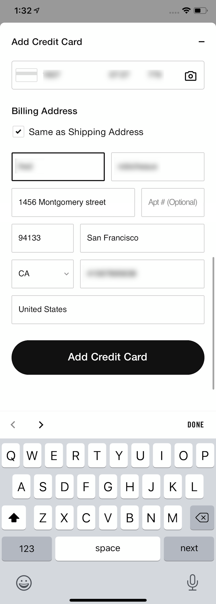
The screenshot was taken on November 11, 2020 and depicts Nike’s Payment. In total, we’ve reviewed 98 of Nike’s page designs. To see them all, visit the full Nike UX case study.
Research Guideline #555
Importance: Essential · Multi-Platform
Dig deeper: Implementation breakdown, UX advice, Underlying UX research
This content is only available in Baymard Premium — get full access
Research Guideline #583
Importance: Impactful · Multi-Platform
Dig deeper: Implementation breakdown, Underlying UX research
This content is only available in Baymard Premium — get full access
Research Guideline #566
Importance: Essential · Multi-Platform
Dig deeper: Implementation breakdown, UX advice, Underlying UX research
This content is only available in Baymard Premium — get full access
Research Guideline #668
Importance: Impactful · Multi-Platform
Dig deeper: Implementation breakdown, UX advice, Underlying UX research
This content is only available in Baymard Premium — get full access
Research Guideline #568
Importance: Detail · Multi-Platform
Dig deeper: Implementation breakdown, Underlying UX research
This content is only available in Baymard Premium — get full access
Research Guideline #720
Importance: Essential · Multi-Platform
Dig deeper: Implementation breakdown, Underlying UX research
This content is only available in Baymard Premium — get full access