Format the ‘Expiration Date’ Fields Exactly the Same as the Physical Credit Card (90% Get It Wrong)
Since our earliest days of usability testing at Baymard, we’ve observed users struggle to input their credit card expiration date — a seemingly simple field to complete.
In fact, users are hindered by websites that have expiration date drop-downs where the expiration values don’t match what’s printed on users’ physical credit cards — with a slowed-down checkout, needless validation errors, and abandonments as a result.
The issues caused by websites failing to match expiration date values in the checkout with what’s on users’ physical credit cards were observed during our very first rounds of checkout usability testing dating back to 2010. Since then this behavior has been reconfirmed during all subsequent checkout usability testing, including our most recent Cart & Checkout usability study and our Mobile usability study.
In this article, we’ll discuss the test findings from our Cart & Checkout testing related to credit card expiration date fields. In particular, we’ll discuss:
- Why payment fields are different from other fields users encounter in checkout
- Issues caused by expiration date fields that don’t match what’s on users’ credit cards
- Specifically how not to format expiration date fields
- Observations and considerations on using text fields, rather than drop-downs, for expiration dates
- Three formatting solutions verified to work well
How Payment Fields Are Different from Other Checkout Fields
To understand how a mismatch between how expiration date fields are implemented in the payment interface and how they actually appear on a user’s physical credit card can cause severe issues for users, it’s worth considering the context in which the expiration date will be entered by users.
As users move through a checkout form, they generally type most information from memory — their street address, phone number, etc. The credit card fields, however, are different, as users break their attention from the interface to physically remove their wallet, withdraw their card, and then input the card number, expiration date, and security code seen on the physical card into the appropriate fields in the checkout flow.
Hence, within the payment fields, users are switching their attention from the physical credit card to the checkout interface.
This has consequences for how users input their information. Instead of only having field labels and styling as guides when inputting their other information, when users are inputting their payment information they often have two competing representations of how their data should be inputted — the interface’s fields and what appears on their physical credit cards.
When there’s a mismatch between these two representations, some users will encounter errors as they try to translate from one representation to another.
Issues Caused by Expiration Date Fields That Don’t Match What’s on Users’ Credit Cards
For the vast majority of users, issues caused by a mismatch between the expiration date fields on the interface and the date represented on the credit card are relatively minor, and most users during testing eventually made it past the fields.
However, depending on how the fields are implemented (see next section), many users will slow down or come to a halt at the field as they translate from what they see on their credit card to the expiration date fields, if the two representations don’t match.
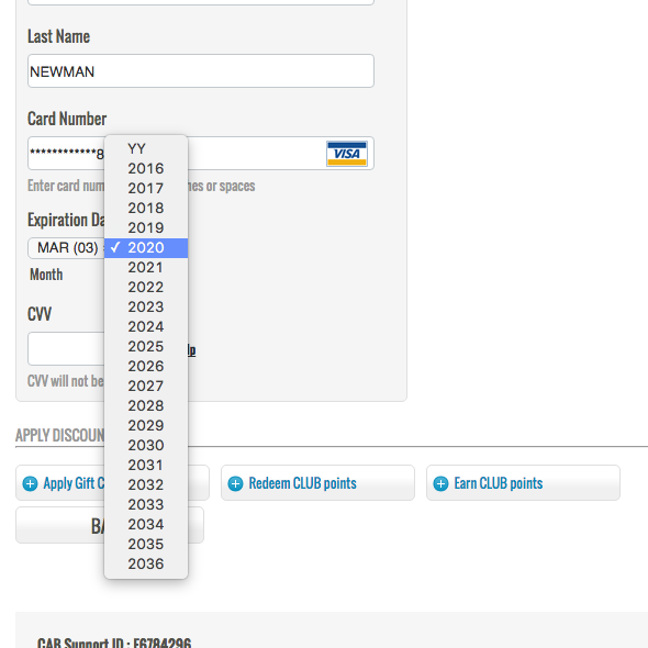
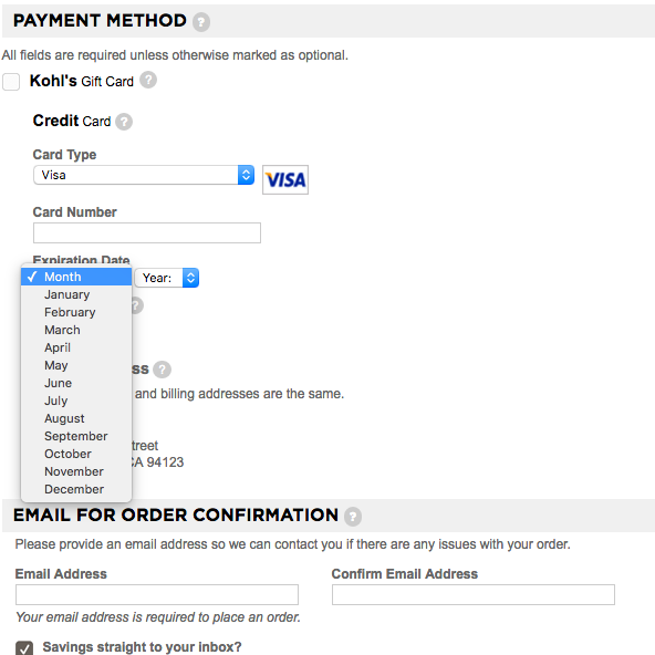
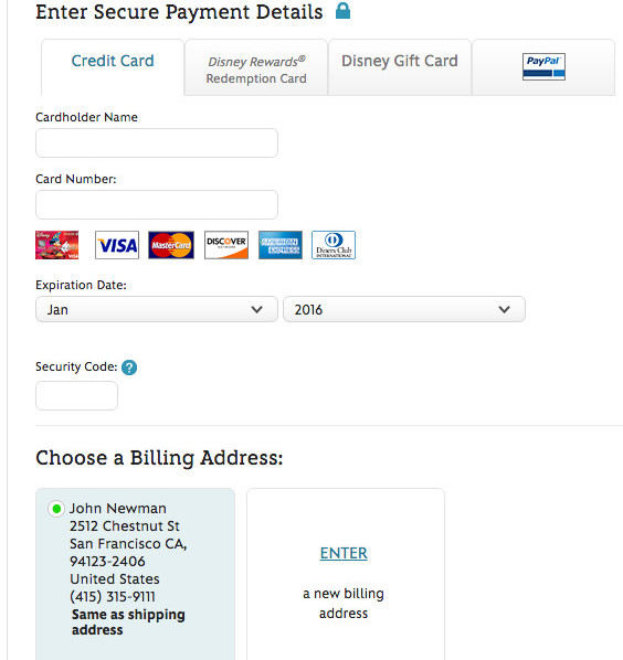
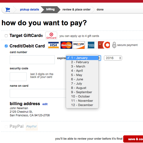
For example, when the month field was implemented as a drop-down with only the name of the month displayed, some users during testing were observed to actually count on their fingers as they translated from the numeric representation of the month on their card to what they saw on the interface.
Other users — 24% in our testing — who prefer to use the keyboard to input the expiration date will come to a complete stop, and revert to using the mouse. This interrupts the smoothness of the form-filling process and adds to the time it takes to complete the checkout.
Validation errors are more likely when the expiration date fields don’t match users’ physical credit cards.
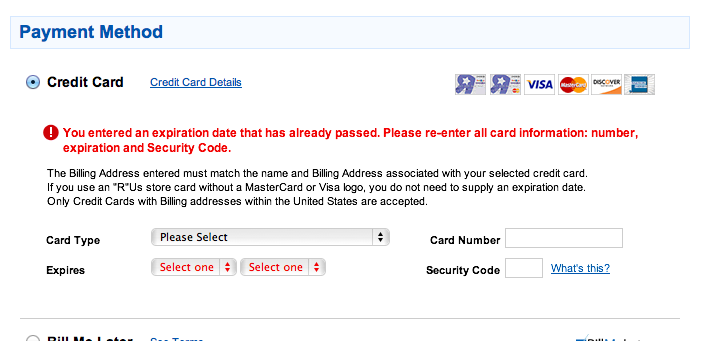
A minority of users, however, will encounter payment validation errors because they’ve inputted the card’s expiration date incorrectly. This can lead to abandonments, depending on the error-recovery experience. For example, are all the payment inputs cleared after the expiration date error? Are users scrolled to the field where the error occurred? Are they provided with clear, highly specific error messages?
During our testing we observed any one of these issues (much less all of them in combination) can be a direct cause of users abandoning a purchase.
How Not to Format Expiration Date Fields
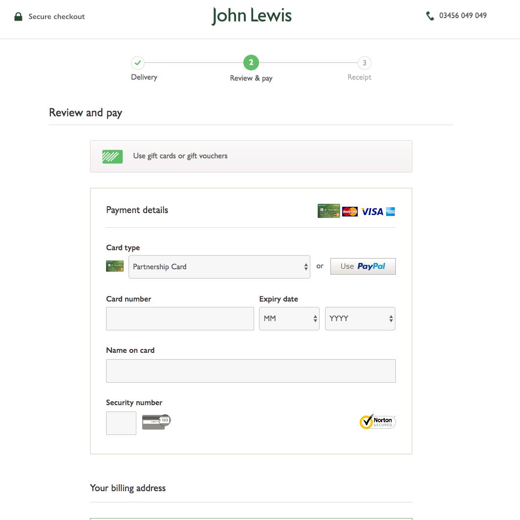
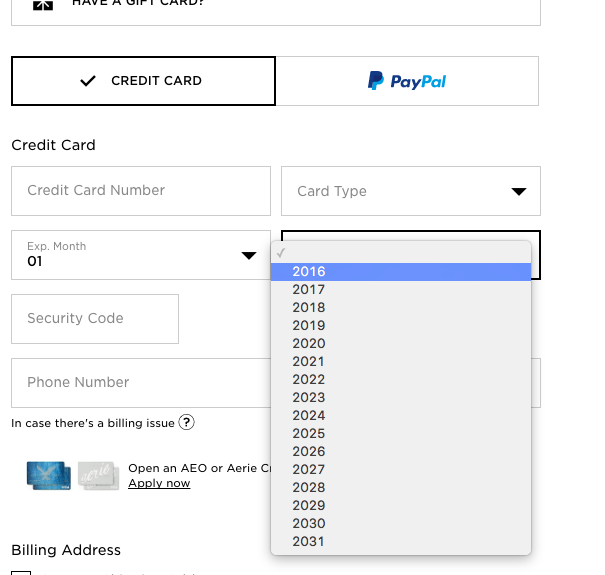
As our benchmark reveals that only 10% of sites format expiration date fields to match what’s actually printed on the card, it’s worth looking at some examples of how the other 90% of sites format expiration date fields, in order of most problematic to least.
How Expiration Date Fields Should Be Formatted
The ISO 7813 standard specifies the characteristics of “Financial Transaction Cards”.
In short, all financial transaction cards should show the card’s expiration date in one of the following two formats: “MM / YY” or “MM-YY” — with the first being the by far most common for credit cards. This represents two digits for the month and two for the year — for example, “02 / 24”.
Adopting this format makes it very easy for users to enter the correct input because they don’t need to translate the numbers on the card to the corresponding month name, or worry if they’re supposed to enter another set of values altogether.
Furthermore, the ISO standard supports keyboard users who will attempt to enter exactly what they see printed on their card using their keyboard (24% in our testing). (Note: of course, users must first be allowed to tab into the month field in the first place to avoid breaking the flow, which is sometimes an issue with custom-designed drop-downs.)
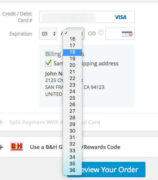
We have however observed one deviation from the ISO 7813 “MM / YY“ standard that has not shown to cause usability issues: if the month name comes after the two-digit month number in the month drop-down (e.g., “03 - March / 24”).
This will still allow users to use the keyboard to input the expiration month and to select the digits as they see them printed on their card.
The expiration date drop-downs can be improved even more by including a forward slash to separate the month and year fields, as well as by adding labels beneath each field (i.e., “Month”, “Year”). These minor design touches will make it even clearer to the user what information is expected in each field.
Considerations When Using Text Fields Rather Than Drop-Downs
During testing, using text fields, rather than drop-downs, for the expiration date fields proved to be somewhat odd to users, with 66% encountering issues or coming to a halt as they encountered what they found to be an unconventional interface.
The test data are however inconclusive as to whether text fields represent a large issue for users or not. As drop-downs have consistently been verified to be a well-performing input type (as long as the “MM / YY” formatting is adhered to), text fields in comparison represent an unverified input pattern through large-scale usability testing.
If there’s still an interest in experimenting with text fields for the expiration date inputs, consider using either two separate fields for month and year (placed right after one another, on the same line, with a forward slash in between), or use a single input field with an input mask. The text fields should also match the expected input length.
Furthermore, the open text fields will need to restrict the user’s input to prevent users from typing invalid values, while still allowing some degree of input flexibility. For example, for the month input “03” and “3” are valid input values; users may also type “1”, which is valid if they don’t type anything else or if they type 10, 11, or 12, but is invalid if they type “13”.
For entering the year, it can reasonably be expected that users will try to type both 2- and 4-digit years. In practice, this makes live inline validation and the use of input masks technically difficult to implement without provoking needless errors, restricting users’ input (e.g., 1-digit months, or 4-digit years), or allowing too-many invalid values.
Don’t Make the Expiration Date Fields Unnecessarily Difficult to Complete
Users shouldn’t face obstacles when entering the most basic information, such as credit card expiration date fields.
Forcing users to translate from what they see on their physical credit card, to the format preferred by a particular site for the expiration date fields, makes it unnecessarily complicated to complete the payment fields.
Adjusting the expiration date fields to match the standard is an example of “low-hanging fruit”: a UX performance boost that’s relatively easy to implement.
Furthermore, attention to these sorts of details is part of what sets “State of the Art” checkout experiences apart from “the rest”.
And yet we find that only 10% of sites use the preferred format for expiration date fields.
This article presents the research findings from just 1 of the 580+ UX guidelines in Baymard Premium – get full access to learn how to create a “State of the Art” cart and checkout user experience.
User experience research, delivered twice a month
Join 25,000+ readers and get Baymard’s research articles by RSS feed or e-mail:
Topics include user experience, web design, and e-commerce
Articles are always delivered ad-free and in their full length
1-click unsubscribe at any time
We first published an article on the topic of “Expiration Date Fields” in October of 2012. This article has been rewritten entirely with our newest usability test findings.
Related Articles
More E-Commerce Research
Free Research Content:
- Popular Articles · a listing of our most popular research-based articles on e-commerce UX
- UX Benchmark · benchmark with case studies of 123 major e-commerce sites ranked by e-commerce UX performance
- Page Designs · navigate 9,200+ manually annotated full-page screenshots categorized by page type
Products & Services:
- Baymard Premium · full access to all 620 research-based design guidelines, UX case studies, page designs, and review tool ($720-$3,000 / year, based on plan)
- UX Audit · get an in-depth analysis of your site’s UX, conducted by a Baymard researcher ($1,900-$9,700 based on scope)
Comments
Premium Research
Get full access to Baymard’s 78,000+ hours of research and empower your UX team and decisions.
Audit Service
Get Baymard to audit your site’s UX performance, compare it to competitors, and identify 40 areas of improvements.



Jessica EndersOctober 24, 2012
Don’t you just slap your forehead that articles like this even need to be written? I empathise!
But on a more serious note, do you know if it would be possible to use the card number to detect what card type it is (i.e. American Express, Visa, Mastercard etc) and then, knowing that, format the date fields to match exactly as on the card? Obviously this would be the ideal with all the trimmings – so not /necessary/ – but I’m curious whether it’s possible.
Christian, Baymard InstituteOctober 24, 2012
Hi Jessica,
Yes it is possible to detect the card typed based on the first 6 characters of the card number (called the IIN range). E.g. VISA start with 4. Most AMEX 34 or 37 and so on. But the IIN range contains much more info than that. It is also tied to the issuing bank.E.g. a card starting with “454305” would be a VISA card issued by Royal Bank of Scotland.
Where your idea gets a bit more difficult to execute is knowing exactly how each issuing bank format their expiration date and then tie that to their IIN range. (Someone should do such a list.. you, me, the card organizations? – is it worth it?)
But on a more basic level you could use the IIN range to change the description for the security code field accordingly. As you know VISA and MC is 3 digits on the back, AMEX is typically 4 on the front. With clever use of the IIN range customers entering a VISA card number won’t see a Security code form description that reads “VISA/MC: 3 digits on the back. AMEX: 4 digits on the front” but only what applies to them, and vice versa. Like this:
https://www.dropbox.com/s/wgp1k7817sj9ckg/dynamically%20change%20the%20security%20code%20description.mov
[Anonymous]August 17, 2016
Jessica Enders Great Response!
Martin SansomOctober 24, 2012
A superb article – one thing that isn’t clear though in your article is whether payment cards in America use the US standard way of displaying at date rather than the UK version.
i.e.
US = Month, Day, Year
UK = Day, Month, Year
There are many websites which allow users to switch prices to their preferred currency, but I’m guessing that 99% of those sites fail to switch the date layout at the same time.
Does your research indicate whether this could be a problem, or are users smart enough to figure it out?
I’m assuming that labelling the input boxes helps, but many people would just follow blindly what it says on their Visa card.
Christian, Baymard InstituteOctober 24, 2012
Hi Martin,
Great question. The credit card expiration date is for most cards only a month and a year. And luckily in both the US and UK format you mention the year comes last, so MM/YY won’t be a problem in that regard.
Outside the context of credit card forms you are however on to a great point. We’ve recently seen a test subjects order a flight for a completely wrong date (!) because the site used US format (MM/DD/YY) and the subject was used to DD/MM/YY. For this reason we’d recommend that you always write the month as a name whenever you display a specific date (January 5th, 2012 instead of 05/01/2012 or 01/05/2012).
JoeDecember 7, 2012
Thank you for this article! And thank you Jessica (http://formulate.com.au/) for bringing it to my attention.
I ask people all the time if they notice this but to be honest, they tend to gloss over it. They’re focussed past it, for when the site confirms the transaction and they can get on with their lives. However, when testing sites in a controlled environment I do get people asking why it is asking for a name-month when the card is a number-month. I can understand someone thought it might be helpful but it is clearly a case of “thought it might help” instead of “proved it might help”. Your analysis clearly shows it doesn’t help.
To be exact, the form isn’t asking for the “month” at all, it is looking for a value from you that it can supply to the payment gateway that helps that gateway process the order. So if it has 03/13 on the card, we really should be capturing 03/13 in the form, regardless of all these other influences. it could equally be supplying two letters, what matters is the process requires two numbers so we should comply with that. The separator is a moot point, since we don’t need to enter that and can regex it out of the way anyway.
Asking the user to translate 06 to 6 – June is completely unnecessary and in some cases, interferes with the process.
Out of curiosity. how does the 60% who use one of your two optimal solutions break down? I’m hoping it is a majority for number only, but not holding my breath.
Kashish SharmaApril 2, 2015
How would you update the ‘year’ range dynamically or using html
Scott TaylorNovember 14, 2015
Do you have any idea why the standard embossing isn’t defined as “MM/YYYY” with four-digit years? That would push out the month/year ordering issue from “80 years” to basically never. (I’m surprised that the four-digit year representation hasn’t become the norm after the Y2K debacle….)
nobodyDecember 29, 2015
Anyone have an idea on what the best practice is on number of fields for the expiration date?
I think two fields with dropdowns (one for months, one for years) is simpler for the user while another person I work with thinks a single field where the user has to input the months and date via keyboard is simpler. Thoughts?
Christian, Baymard InstituteFebruary 1, 2016
We have tested “text field vs. drop-down” specifically in our upcoming study on e-commerce checkout usability which will be out later this year.
Ben RuggebergOctober 19, 2016
I look forward to seeing that! We have been discussing it a lot at my organization as well.
BenJanuary 13, 2017
I am also looking forward to seeing the results. In particularly with respect to mobile user.
Mega WeiseJune 29, 2018
Do you mind linking to that article?
Christian, Baymard InstituteJuly 4, 2018
Hi Ben and Megan, at Baymard we release approx. 5% of all our findings as free articles (like this article on expiration date). 95% of the research findings are available in Baymard Premium; https://baymard.com/premium
If you have full access to our research catalog, the guideline that contain our test findings on the expiration date field is https://baymard.com/premium/guidelines/577
Christian, Baymard InstutiteOctober 31, 2018
The article is as of today (Oct 31, 2018) re-written with these new findings.
Erik bryanSeptember 16, 2017
How do I enter ending date 06/20 urgh in 4 digits
Michael BNovember 1, 2018
A little dated based on today’s ecosystem don’t you think> ??
Dan BlackNovember 1, 2018
How so?
If 90% of their sample size are not meeting the standard, then it’s hard to argue it’s dated.
Christian, Baymard InstutiteDecember 3, 2018
Hi Michael, I’m not quite sure what you are referring to.
The article is published as of Oct 31, 2018 re-written with new large-scale usability test findings.
If you are referring to “does any sites have this issue” then see Dan Black’s comment below or the article headline, it’s 90% of the top 60 e-commerce sites in the US and Europe that suffer from this issue.
Online BankingMay 14, 2019
Your article went into depths of how online banking UI should be implemented, it’s sad that a lot of websites do not mention such a crucial item. I think proper MM / YY format is a must when it comes down to credit card information.
ThomasAugust 30, 2019
Is there a difference in usability on mobile for text fields versus select menus? I’m curious if opening native pickers on a small screens is cumbersome versus a pre-formatted type through?
anker soundcore proApril 30, 2020
Hi, thanks for this awesome explanation. Quick question, I am using this format for a “bills payment checklist” so basically when the bill due date is 30+ dates away it is green, less than 30 days yellow, and past due red. I have also added a “checkbox” to click when the bill is paid. How can I make it reflect as green when I check the box, even though the date is past today? For example: right now, I have paid a bill for Oct 1st, but it is still showing red because it is Oct 6th, but it is not taking into account that the “Bill is Paid” box is checked.
k collinsSeptember 15, 2020
what does m/m stand for iput in month and they keep regetting it